

The fear of colour in luxury wardrobes is almost universal — and almost universally misplaced. Here's how a stylist approaches colour as a tool rather than a risk, with specific guidance for the Monaco and Riviera context.
The neutrals trap
The most common wardrobe failure I encounter among new clients is not too much colour, it is too little. A wardrobe built entirely of camel, navy, ivory, and grey is a safe wardrobe, but it is also a flat one. In a context like Monaco, where the light is extraordinary, where the social events are intensely photographed, and where the audience is highly sophisticated — a monochrome wardrobe reads as fear rather than confidence. The clients who are most consistently remembered, most consistently striking, and most consistently well-dressed are those who use colour deliberately and precisely.
The question is not whether to use colour. It is which colours, in which forms, in which combinations.
Understanding undertones before anything else
The single most important technical concept in colour dressing is the undertone of your skin. Human skin undertones fall broadly into three categories: warm (yellow, peachy, golden), cool (pink, blue, red), and neutral (a mix of both). The colours that work best on any individual are those that either harmonise with or deliberately contrast their undertone in a considered way.
A warm-undertoned person will almost always look extraordinary in warm colours: terracotta, warm coral, golden yellow, olive green, warm caramel, deep rust. These colours reflect warmth back from the face. The same person in cool colours — icy pink, mint, blue-grey, can look washed out unless the contrast is managed through makeup or accessories. The opposite holds for cool-undertoned individuals: jewel tones (sapphire, emerald, deep plum, burgundy) and cool neutrals work in a way warm tones do not.
This is not a rigid rule — it is a starting point. The most sophisticated colour dressers know which rules to break and why. But it is the correct analytical foundation.
The Monaco palette: what the light demands
Monaco's Mediterranean light is warm, strong, and highly saturated, particularly from May to September. This light does specific things to colours. Strong colours — cobalt, deep coral, vivid emerald, warm terracotta — intensify and become even more vivid. Pale pastel colours can wash out entirely or read as something close to white from a distance. Dusty or greyed-down colours — the muted sage greens, the dusty roses — sometimes lose their subtlety and read as simply undecided.
The practical conclusion: in Monaco's light, it is worth committing. A strong cobalt in this context is magnificent. The same cobalt might be overpowering in a grey London interior. Conversely, the sophisticated neutral palette that reads with complexity in Paris — Farrow & Ball tones, dusty French blues, greyed lavenders — can read as bleached in Monaco's outdoor context. This is why Missoni's vivid intarsia prints work so consistently here: the warmth and intensity of their colour is designed for southern light.
The three ways to introduce colour
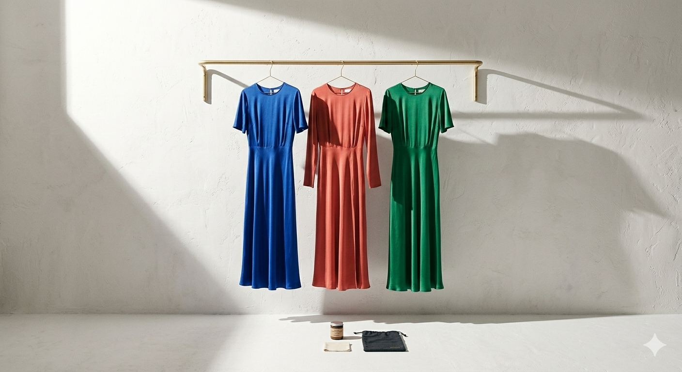
As the anchor of the look. A single colour-saturated piece — a Valentino cobalt dress, an emerald Max Mara coat, a deeply coloured Loro Piana cashmere — built around neutrals. This is the most confident approach and the most visually striking. The rest of the outfit (accessories, shoes, bag) should be neutral: ivory, camel, gold, or black depending on the colour. The colour carries the look; everything else supports it.
As an accent. A neutral foundation — ivory suit, white blouse, cream trousers — punctuated by a single colour accent: a belt, a bag, a silk scarf, a shoe. This is more accessible and almost universally flattering. The key is the quality of the accent piece: the colour must be saturated and precise, not muddled. A Hermès scarf in a strong colour worn at the neck against an ivory blouse is one of the most effective and enduring combinations in this register.
As a considered combination. Colour-on-colour dressing is the most advanced skill and the one most clients resist unnecessarily. There are reliable starting points: analogous colours (those adjacent on the colour wheel — coral with warm orange, cobalt with violet, emerald with teal) tend to work without effort. Complementary colours (those opposite — red with green, blue with orange) are more dramatic and require more precision to carry successfully. Tonal dressing — the same colour at different saturations and values — is an increasingly central approach in quiet luxury dressing and one that Monaco's light handles particularly well.
The pieces worth investing in with colour
Not all pieces merit colour investment. Outerwear, shoes, and bags in colour are long commitments that need to be integrated into a wardrobe over many seasons. This is why I recommend starting colour investment with smaller pieces: a cashmere knit, a silk scarf, a belt. These are lower-stakes introductions that allow a client to understand how a particular colour actually behaves on their body and in their life before making a larger commitment.
The exception: a strong-coloured dress or suit, bought in a quality that will last a decade, in a colour that genuinely suits the wearer, is one of the best investments in any wardrobe. It will never read as wrong in the right context, and in Monaco's social world, the right context arrives frequently.
If you'd like to work through the colour questions in your wardrobe, or build a more vivid, more deliberate visual identity, discover my Personal Shopping & Wardrobe Exclusive service.


%20(1).webp)